Fortress Occident Developer Blog

Comments

Shedding light

Hi there.
I am the technical artist of this project, chiming in with some technical tidbits. Gentleman

Interior lighting system

tl;dr: this scene has no in-engine lights. All lighting is computed from:
- RGB neutral render with paintover
- BW shade/light multiplier map encoded into albedo map’s alpha channel
- RGB light direction map
- global sun/shade color variables for each time of day

Additive shade map didn’t work out because it tended to have inverted color information in dark areas (pretty obvious in hindsight, duh). Converting additive map into BW resulted in super-saturated dark areas (pretty obvious in hindsight, duh).
Multiplicative light/shade map seemed to be acting nicely if it weren’t for the 0-to-1 clamp of the PNG format. Let’s not go into minifloats or EXR for now.

Enter the arctangent encoding

You take a value from 0 to infinity and arctan() it to squeeze it into the 0-1 range. You take the map in engine and do a quick tan() before multiplying it onto your map. You have high resolution near 0 and degrading accuracy towards infinity which hasn’t been detectable by eye as of yet.

Lightfield map
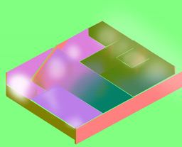
This (currently hand-crafted) map describes the direction and magnitude of a single ray of light in each point of a 2D space. So technically a very very simple lightfield wannabe. This is a vague, efficient and apparently good-enough description of which direction the natural light is coming from. This technique relies on lighting conditions being very low frequency and similar on and behind the objects and characters.

The white blobbing you see there is alpha channel we are using to map out faux indirect illumination where low alpha values near the windows result in a strongly directional light with stronger shades/shadows whereas high alpha values mean light bouncing around more. So the shaders wrap more light around objects and lighten up shade/shadows a bit.

Highlighting of interactables
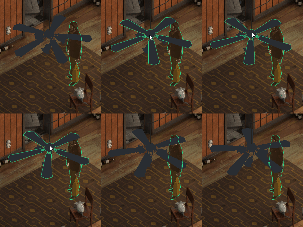
This was apparently a headache and a half! I consider myself pretty knowledgeable in common game graphics techniques but it came as a surprise that apparently finding the outlines of 3d objects is a relatively difficult task. Shows what I know. I’m told it’s done by enlarging 3d objects along the normals? We ended up using masks and edge detection for various reasons but that’s another post by kuubaas waiting to happen.

As we witnessed while testing, the normal-extruded outline method is and looks cheap.
For now I’ll just say we use shader replacement to render a mask RenderTexture which is then edge-detected. For silhouette outlines it’s less hassle, more reliable and looks better than any geometry-based solution I’ve seen. (you also get free AA with edge detection, yay).
It’s quite a plain vanilla solution but the colouring technique could be interesting to write further about. Will do a post this month.

Comments

So the first month of 2016 has come and gone

So the first month of 2016 has come and gone. We begun January with finishing up the prototype we made for Christmas. The game was far enough along that dialogue was sort..of.. displaying? You could click a button to open up a facsimile of a dialogue window which read content from an xml file. The basics of importing text from Articy into Unity was in place. You could select your options and get your answers based on the dialogue node tree.

Some stuff didn’t work so well however.. The main character was a black ghostly silhouette of a man which could path-find its way around but on some computers got stuck in a Lynchian horror nightmare where you run as fast as your legs can go yet move at a glacial 5cm/h pace. We’ve since fixed that but as with all bugs and graphical glitches it’s excellent dream sequence fodder.

So here’s what got done in January:

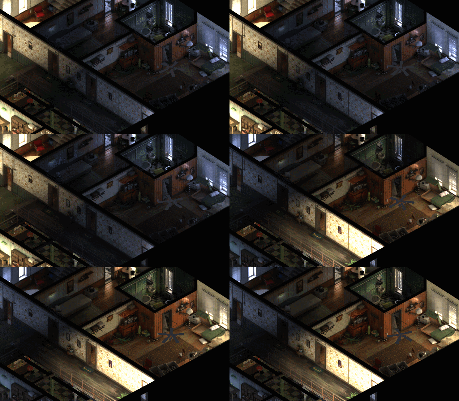
Interior lighting system


We tried a bunch of different ways to light up our interiors with natural sunlight which would change by time of day. Four states in total: morning, noon, evening and night. For a while we had an additive system which used a basic background image, a neutrally lit render for me to paint over. Upon the background we added a light map with information about how much light and what colour came from which window. This had information on bounced light and transferred colour from object to object. While this gave us beautiful rich colours and a realistic global illumination look it also had the downside of adding several full resolution images to the pile of assets making up levels. That’s a map per time of day + the neutral base map. What’s more the additive layer contained too much information which meant that it tended to overwrite any hand painted brushwork I had done on the neutral background image. So that’s no good.

In the end the breakthrough came while we were trying to figure out how to light up characters in interior scenes.

A naive implementation would have cast the neutral background image in shadow and used in-engine lights to illuminate the scene and light up characters in one go. This is essentially what we do with exteriors during the night. However this method would have looked bland since real time doesn’t really get us that coveted and beautiful diffused bounce light ambience that we can get with prerendering. In the end we lit characters up with a mixture of a lightfield map for natural light coming in the window and in engine light sources for artificial illumination such as desk lamps and the sort. The lightfield map is essentially a normal map which dictates which direction light is moving on any given pixel. It’s also very small since we don’t need it to be terribly precise.

Turns out that the lightfield map is useful for other stuff as well! We can render out a single channel B&W image of the background as illuminated only by natural light. By using this shadow map with the lightfield map we can dim and colourize background art based on time of day and the weather outside. While not as exquisite as the additive method it’s a lot more efficient, saves us a ton of hard drive space and makes the base background layer the only image with color information which means I’m free to paint over it as I wish!

Neutral render with some light hand painted touches, not final in any way or form:

Highlighting of interactables

This was apparently a headache and a half! I consider myself pretty knowledgeable in common game graphics techniques but it came as a surprise that apparently finding the outlines of 3d objects is a relatively difficult task. Shows what I know. I’m told it’s done by enlarging 3d objects along the normals? We ended up using masks and edge detection for various reasons but that’s another post by kuubaas waiting to happen.

Attaching dialogue to interactable objects

Combine this with the highlighting and you have a game! There’s this imposter syndrome article making the rounds on the internet about creatives who feel like they’re still faking it. Not for me, no sir, the moment an object got highlighted on mouseover and clicking on it opened up a dialogue I felt like a super-MLG-pro-designer. What I’m trying to say it it feels good to have immediate feedback mechanics in the game finally.

Character scale matrix

We dicked around with a character shape matrix, a simple two slider system for adjusting thickness and height for npc variety using blend shapes. This posed some problems with floating feet but in general the proof of concept implementation seems promising so far. We’re also working on an IK system for placing feet on stairs which might tap into the floating feet problem.

Basic inventory & equipping system

Take all your clothes off, put them back on again, like a normal human being does every day.

Functional doors

They block pathfinding and can check said inventory for keys. Imagine a world with door tech which helps you out by checking whether you have your trousers on or not.

Comments

Worldbuilding

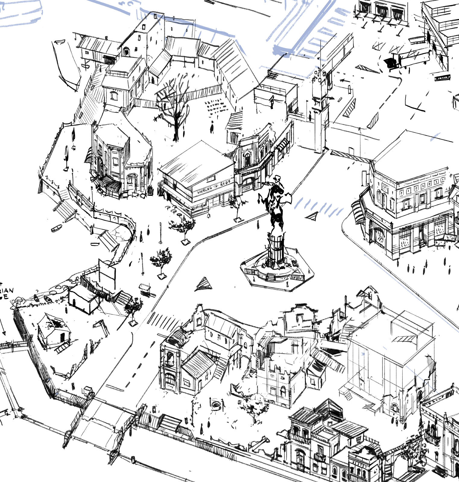
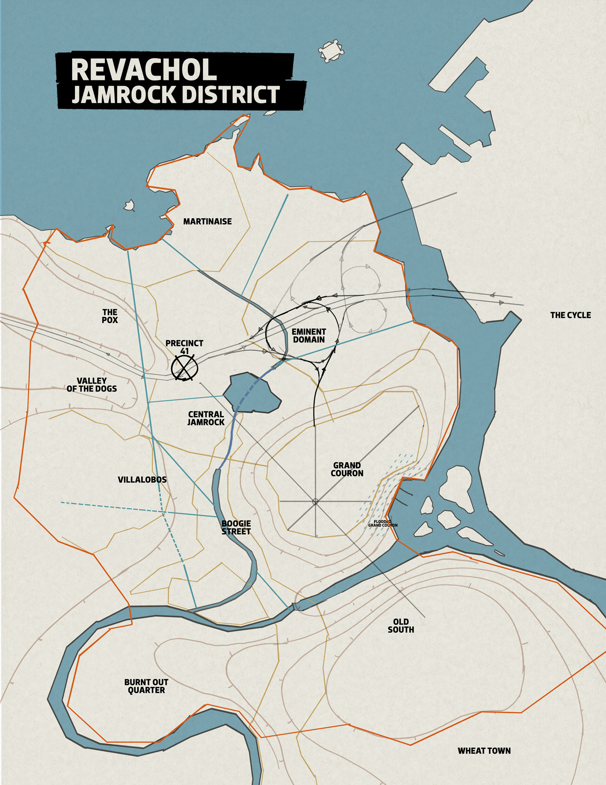
So the game takes place in the “bad part of the bad part of town” of the city of Revachol. The district you police is called Jamrock (“in honour of the island nation of Jamaica” nonetheless - or so I’m told by the boys in worldbuilding). More specifically, the neighbourhood “No Truce” takes place in is a coastal fraction of Jamrock called Martinaise. The city has been built and rebuilt across a span of four hundred years and the architectural styles present reflect that. We’re pedantic with how history works, in regards to the layers of technology and culture piling on top of each other. There are also modern cultural aspects that shape what different neighbourhoods look like. Immigrants from different parts of the world etc.

The game’s worldbuilding at large has places like Boogie Street, a street come ghetto of Semenine immigrants, whose abstract wood architecture and innovative techno music is poised to ride an invasive wave of pop culture to a civ style cultural victory. (Yes, really). There is Villalobos, the part of town populated by Mesque immigrants whose youth are essentially latino gangbangers in mesh wifebeaters. The neighborhood itself is a byzanthian labyrinth of housing that’s claimed the streets underneath; where one is never quite sure if you’re indoors or outside. Imagine a dungeon-district! An RPG city district that doubles as an ongoing dungeon, phasing from hidden street to meth-lab to salsa party.

Blam, you stepped into the wrong room motherfucker - salsa party!

Hope you brought your maracas!

Be armed to the teeth with maracas when you come to the… okay I’ll stop now.


(click for a bigger image)

Eminent Domain is a neighbourhood of old workers’ barracks being torn down to make room for a massive elevated motorway interchange. Locals build up against the pillars of the motorway and nix electricity from the high voltage powerlines.

Martinaise however is a coastal area. Here our “atmospheric target render” (another expression from the boys in worldbuilding) is encapsulated in the sentence: “I’ll wake up in a new life, shift shape and shoe shine.

Damn it all to do now, down by the seaside…”

Imagine old pre-revolution military pride dilapidating aside modern misery, while “On The Waterfront” style harbour work goes on in the background. The coast is marked by old Havanaesque architecture now in disrepair, large swathes of which have been demolished to make room for the ever expanding Greater Metropolitan Port of Revachol, which under coalition governance has grown into the world’s largest industrial harbour. Martinaise is where the revolution was ultimately lost. It is on these coasts that coalition forces landed to quell the uprising and it has the mortar scars to prove it. War damage is still apparent on most houses and locals have used the sturdier bits of ruin to support new, decidedly less baroque buildings. The era of Philipppe III The Squanderer (heir of Philip II The Misuser and Catherine The Lavish) is over, even if his ludicrous mounted likeness in bronze somehow survived. You see, among many, many other things, Philippe III also got prodigal with military regalia. It was “one repulsive laugh after the other” with Phillippe.

Then the Turn-Of-The-Century Revolution came and wiped it all away. Today the equestrian monument is mostly seen by dockworkers and truck drivers.